
If you are selecting photography for use in your business marketing efforts, either from stock images or originals, there are a few things to keep in mind. First and foremost, you want to choose a photograph or image that is going to compliment your company’s style guidelines or project design style. In addition, color palette, symmetry and balance are principles that will help you choose an image that is both aesthetically pleasing and functional for your layouts.
Color Palette
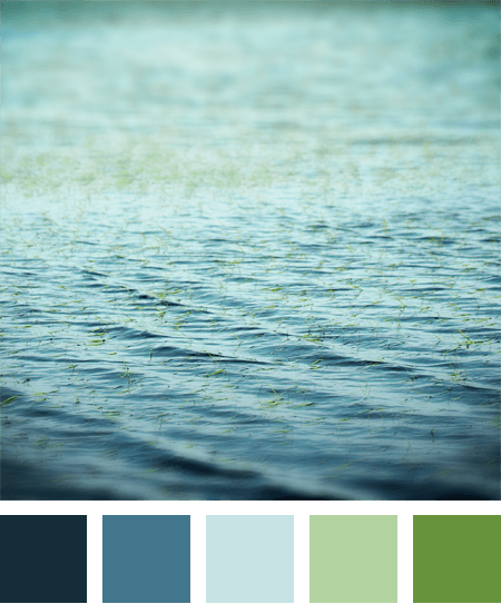
One of the most important things that you want to consider is the color palette of the photo. Color will dictate the mood that you are creating for your audience; therefore you should put thought into the colors you want in a photo. Blues can create a calmer feeling, as well as a cool feeling. Warm colors like reds and yellows with create more of a sense or urgency and excitement. You want to make sure that whatever feeling you are trying to communicate is also reflected through the image’s color palette.
For companies that have an established web presence, your color selection should not only reflect the mood you are trying to evoke for your audience, but it should also compliment your web site’s design and current color palette. For example, you wouldn’t want to use an image that may play a major role on your website that conflicts with the established flow, and user experience.
Symmetry

A lot like the use of color, symmetry, is something that will influence the mood of potential viewers of your website or other marketing messages. When using a photograph for marketing purposes, you again must think about the mood you would like to cultivate.
Perfectly symmetric pictures can evoke a form of stability, whereas asymmetric images can be exciting and artistic to look at. This works the same way with website designs. Very symmetric web designs are very professional looking, and organize information neatly. If you are trying to market creative services or products, asymmetry can often be utilized to point to information that is important.
Balance
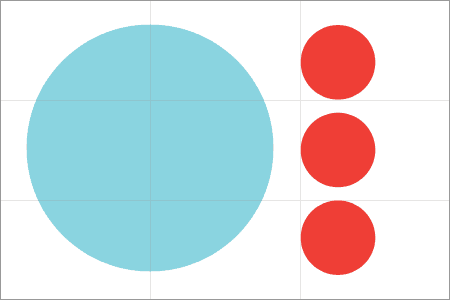
At first glance, the idea of balance in an image might seem a lot like symmetry, but the differences that are important to realize. With symmetry, you want an image to be uniform, and one half of the image looks very much, like the other half. With balance, you are determining how to use empty space. With properly utilizing balance in your images, you can create many different moods, or even find a way to organize information. For example, if you have a photo filled with many subjects without empty space, you are saying that everything in the image has equal importance. By using images with empty spaces, for example, one main subject in the frame, you are drawing the viewer to that part of the image, letting them know this is the most important part.
These basic ideas should be taken into account each time you want to use an image to help in your marketing or design of your marketing collateral. After you become comfortable with the fundamentals of visual layout and design, you always have the option to break these rules to obtain unique aesthetics, but just remember that every decision you make with your design should be intentional and easy to understand.
[hr]If you are selecting photography for use in your business marketing efforts, either from stock images or originals, there are a few things to keep in mind. First and foremost, you want to choose a photograph or image that is going to compliment your company’s style guidelines or project design style. In addition, color palette, symmetry and balance are principles that will help you choose an image that is both aesthetically pleasing and functional for your layouts.
Color Palette
One of the most important things that you want to consider is the color palette of the photo. Color will dictate the mood that you are creating for your audience; therefore you should put thought into the colors you want in a photo. Blues can create a calmer feeling, as well as a cool feeling. Warm colors like reds and yellows with create more of a sense or urgency and excitement. You want to make sure that whatever feeling you are trying to communicate is also reflected through the image’s color palette.
For companies that have an established web presence, your color selection should not only reflect the mood you are trying to evoke for your audience, but it should also compliment your web site’s design and current color palette. For example, you wouldn’t want to use an image that may play a major role on your website that conflicts with the established flow, and user experience.
Symmetry
A lot like the use of color, symmetry, is something that will influence the mood of potential viewers of your website or other marketing messages. When using a photograph for marketing purposes, you again must think about the mood you would like to cultivate.
Perfectly symmetric pictures can evoke a form of stability, whereas asymmetric images can be exciting and artistic to look at. This works the same way with website designs. Very symmetric web designs are very professional looking, and organize information neatly. If you are trying to market creative services or products, asymmetry can often be utilized to point to information that is important.
Balance
At first glance, the idea of balance in an image might seem a lot like symmetry, but the differences that are important to realize. With symmetry, you want an image to be uniform, and one half of the image looks very much, like the other half. With balance, you are determining how to use empty space. With properly utilizing balance in your images, you can create many different moods, or even find a way to organize information. For example, if you have a photo filled with many subjects without empty space, you are saying that everything in the image has equal importance. By using images with empty spaces, for example, one main subject in the frame, you are drawing the viewer to that part of the image, letting them know this is the most important part.
These basic ideas should be taken into account each time you want to use an image to help in your marketing or design of your marketing collateral. After you become comfortable with the fundamentals of visual layout and design, you always have the option to break these rules to obtain unique aesthetics, but just remember that every decision you make with your design should be intentional and easy to understand.
[hr]
Jordan Mendys is a photographer and filmmaker, and also blogs for Direct2TV. He is currently working on a documentary in his home state on North Carolina.
Path: